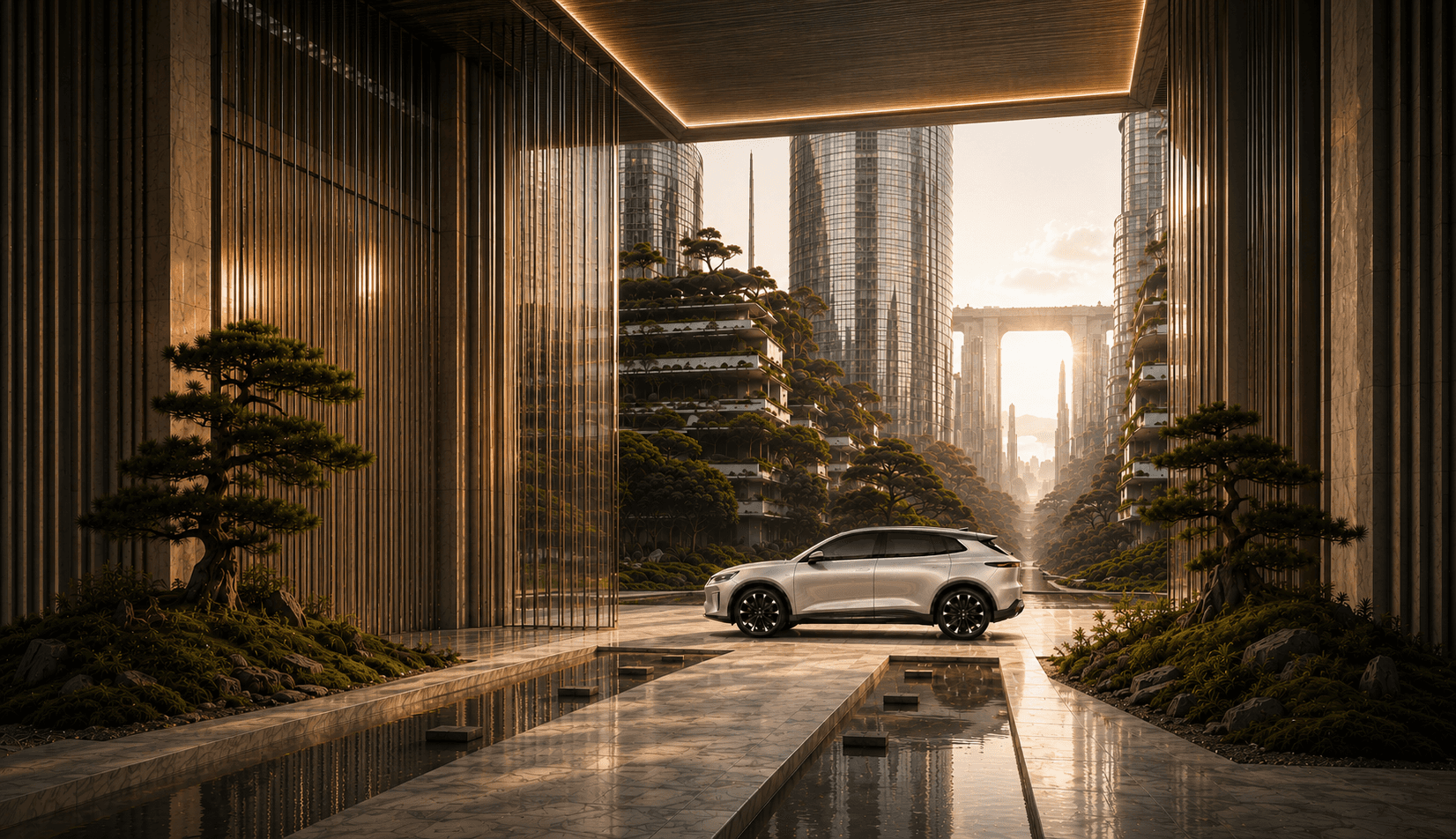
The world of mobility is evolving beyond transportation. It’s becoming an extension of how we live, connect, and care for the planet.


SUSTAINABILITY

HUMAN-CENTERED

TECHNOLOGY

CALIFORNIA MINDSET


VISION
To inspire a world where mobility enriches life—mindfully, beautifully, and intelligently.

MISSION
To create vehicles and experiences that harmonize advanced technology, sustainable design, and human well-being.

VALUES
• Mindful Innovation
• Human-Centered Design
• Sustainable Luxury
• Integrity & Transparency





DIGITAL EXPERIENCE
Every interaction moves with you—from approach and navigation to charging and control.

VISUAL IDENTITY
Primary
Logo
The Auren identity embodies the harmony of innovation, simplicity, and purposeful design. Its distinctive emblem symbolizes forward motion and limitless possibilities, while the custom geometric wordmark reflects precision and modern sophistication. Together, they establish a timeless visual identity that expresses Auren’s vision for the future of electric mobility.

VISUAL IDENTITY
Logomark
The Auren logomark represents progress, innovation, and the freedom to move forward. Inspired by the letter “A,” its upward-reaching form symbolizes aspiration and limitless possibilities. Its clean geometry and refined curves create a distinctive, versatile identity that remains recognizable across different colors, materials, and applications.

VISUAL IDENTITY
Clear Space
Clear space ensures the Auren identity remains distinctive, balanced, and visually impactful. A consistent area of separation must be maintained around the primary logo and logomark, free from text, graphics, or other visual elements. This preserves legibility, reinforces brand recognition, and maintains a refined, premium appearance across all applications.

VISUAL IDENTITY
Typography
Auren’s typography reflects clarity, precision, and modern sophistication. Inter’s clean geometric forms and balanced proportions create a distinctive visual language that complements the brand’s forward-thinking identity. Its versatile weights establish a clear hierarchy, ensuring consistency, readability, and elegance across digital and print applications.

VISUAL IDENTITY
Color
System
Auren’s color system balances innovation, sophistication, and a connection to nature. Glacier White and Titanium Silver express clarity and precision, while Halo Green and Auren Green represent progress, sustainability, and forward-thinking technology. Aurora Copper introduces warmth and energy, creating a distinctive palette that reflects Auren’s vision of a more human-centered electric future.

VISUAL IDENTITY
Brand
Pattern
Derived from the Auren logomark, the brand pattern transforms its signature geometry into a dynamic visual language. Repeating forms express movement, connection, and precision, while enlarged graphic elements create bold, contemporary compositions. Together, they reinforce Auren’s identity across digital, print, and environmental applications.

VISUAL IDENTITY
Environmental
Design
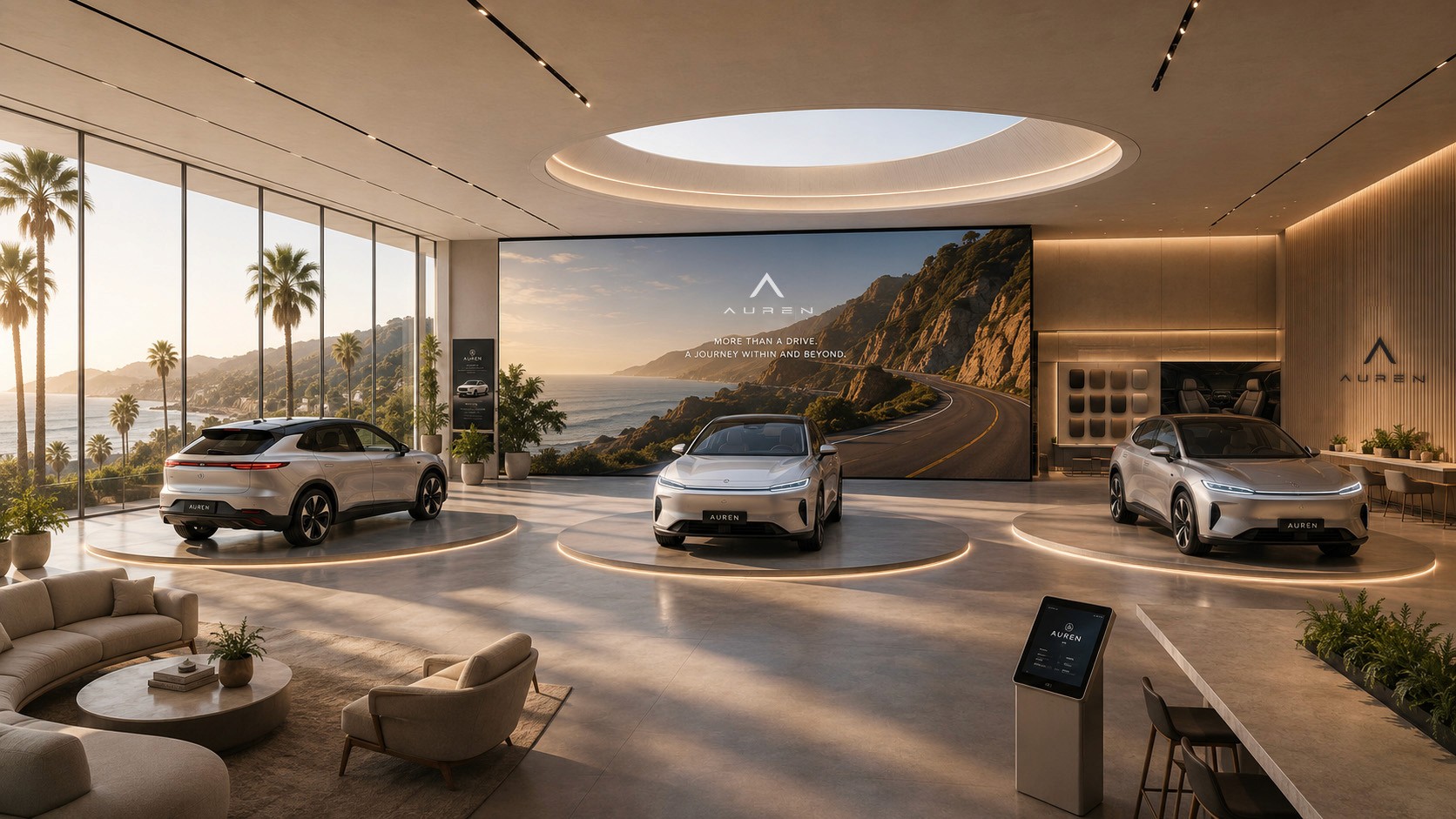
Auren’s environmental design transforms the brand’s vision into an immersive physical experience. Contemporary architecture, natural materials, and thoughtfully integrated lighting create a seamless connection between technology, nature, and human experience. Every space reflects Auren’s commitment to innovation, sophistication, and a more meaningful journey beyond the drive.

VISUAL IDENTITY
Brand
Mockups
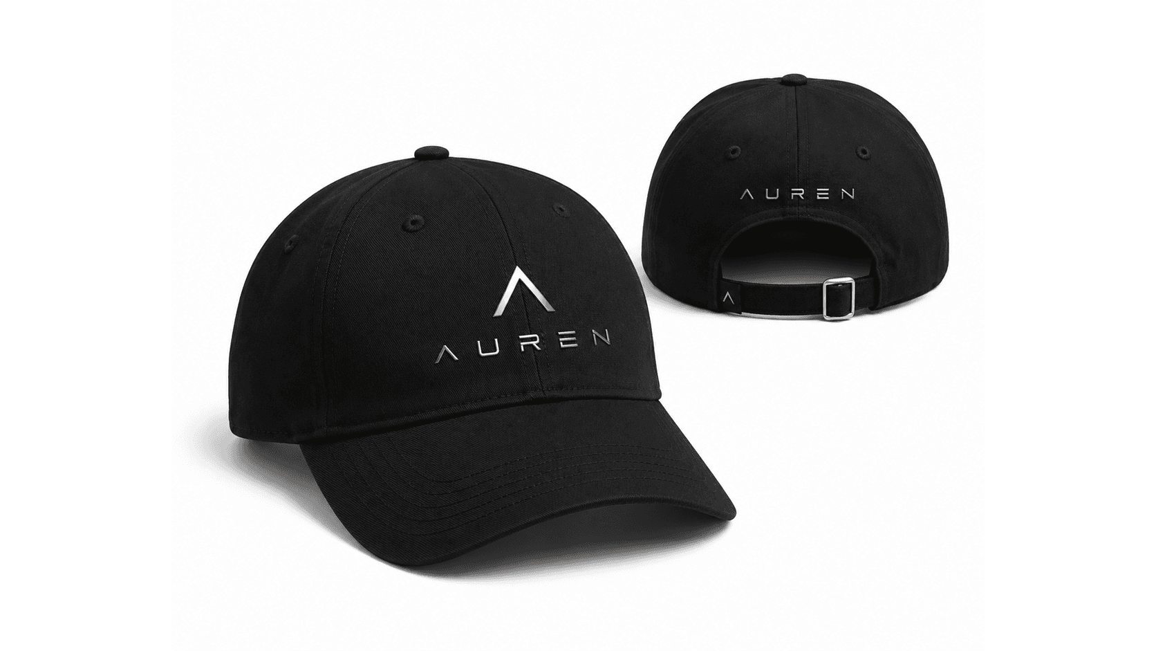
Auren’s brand identity extends beyond the vehicle into everyday experiences. From apparel and accessories to thoughtfully designed products, each application reflects the brand’s commitment to innovation, precision, and modern sophistication. Consistent use of the Auren identity creates a cohesive visual language that strengthens brand recognition and connects people to the Auren lifestyle.

VISUAL IDENTITY
Brand Stationery
Auren’s business stationery reflects the brand’s commitment to clarity, precision, and refined simplicity. From letterheads and envelopes to business cards and notepads, each element incorporates the signature identity, clean typography, and thoughtful use of space. Premium materials and a consistent monochromatic aesthetic reinforce professionalism, sophistication, and a cohesive brand experience.

VISUAL IDENTITY
Iconography
Auren’s iconography combines simplicity, precision, and intuitive communication. Built with consistent line weights and clean geometric forms, each icon represents key aspects of the brand, from innovation and electric mobility to sustainability and human connection. The cohesive visual system ensures clarity, versatility, and a seamless experience across digital interfaces, print, and environmental applications.

BRAND APPLICATIONS
Auren’s identity moves beyond the vehicle—shaping spaces, objects, and every moment of the journey.